plot_waffle creates a waffle plot to visualise categorical data. This plot is useful for
showing proportions or percentages in a visually appealing and easily understandable format.
Usage
plot_waffle(
  data,
  group,
  values = NULL,
  weight = NULL,
  isolateVar = NULL,
  orderPlots = c("none", "descending", "ascending"),
  title = NULL,
  groupColours = colour_pal("catExtended"),
  backgroundColour = colour_pal("French Grey"),
  backgroundAlpha = 0.5,
  borderColour = "white",
  borderWidth = 0.5
)
Arguments
- data
A data frame containing the dataset to be visualized.
- group
The column in
datathat contains the categorical groups for the waffle plot.- values
Optional: The column in
datathat contains the numerical values used for calculating proportions. If not provided, counts ofgroupcategories are used.- weight
Optional: A weighting variable to be used in calculating group frequencies.
- isolateVar
Optional: A specific variable from
groupto isolate in the plot.- orderPlots
Specifies how the plots should be ordered. Accepted values are 'none', 'ascending', or 'descending'. Default is 'none'.
- title
The title of the waffle plot. If the title matches the group name, the function will return the label attribute if present.
- groupColours
A named or unnamed vector of colours for each category in the plot.
- backgroundColour
Colour for the background of the plot.
- backgroundAlpha
Alpha value (transparency) for the background.
- borderColour
Colour for the border of the tiles in the plot.
- borderWidth
Width of the border of the tiles. Default = 0.5.
Examples
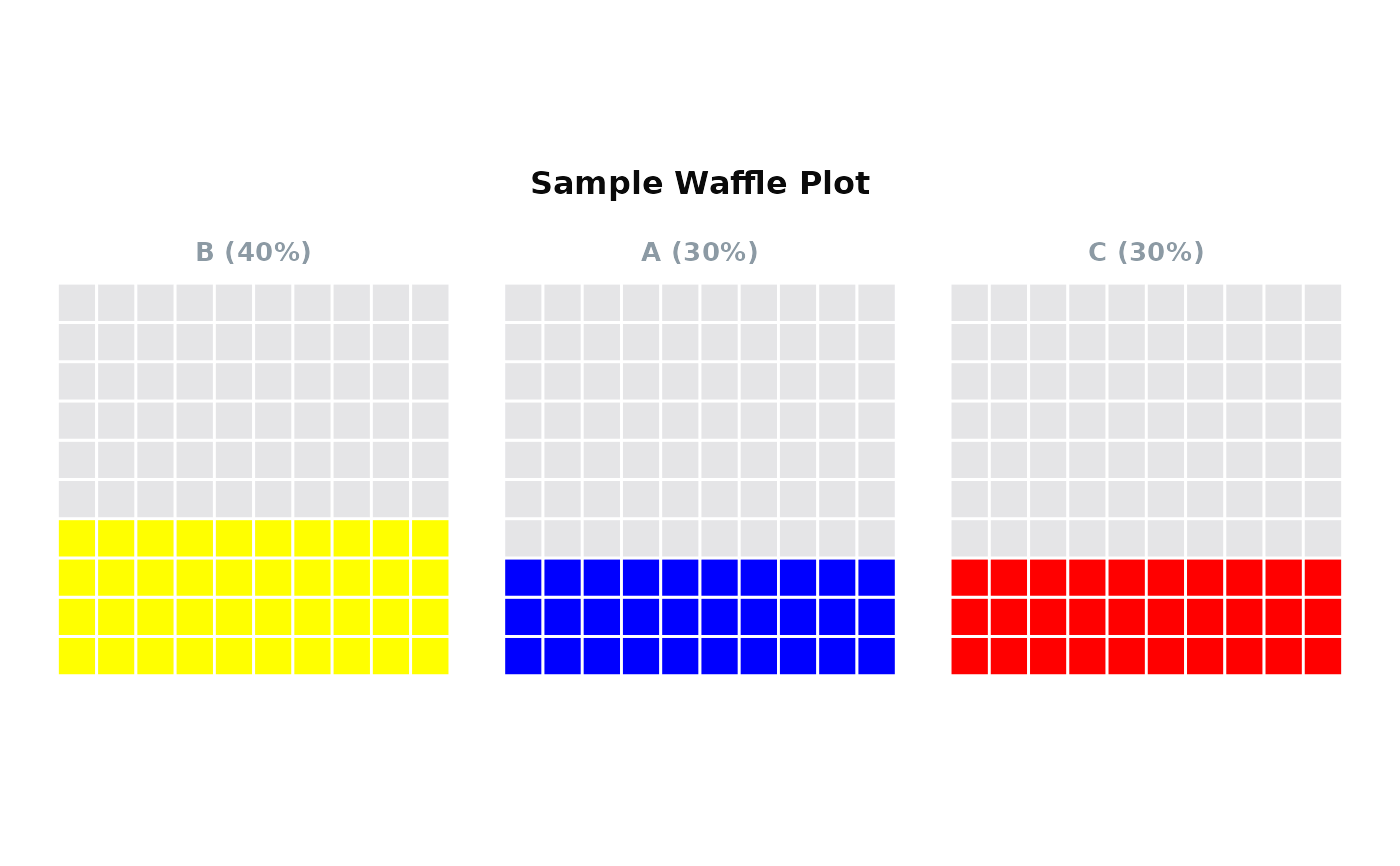
  data <- data.frame(
    Category = c("A", "B", "C"),
    Count = c(30, 40, 30)
  )
  plot_waffle(data,
              group = "Category",
              values = "Count",
              title = "Sample Waffle Plot",
              orderPlots = "descending",
              groupColours = c(A = "blue", B = "yellow", C = "red"))