This article demonstrates the powerful visualisation
capabilities of the scgUtils package, offering tools for
diverse data presentations ranging from personality profiles to
demographic and flow analyses.
Sankey
Flow visualisation helps in understanding how different categories of
respondents transition between various stages or choices. The
plot_sankey() function is instrumental in depicting the
flow of data, especially useful in understanding voting patterns or
changes in preferences over time.
Preparing Data with grp_freq()
Before visualising, prepare your data using grp_freq(),
which aggregates frequencies necessary for the Sankey diagram.
# Subset the required columns from the dataset
sankey_df <- survey_df[, c("wt", "generalElectionVote", "p_past_vote_2019")]

# Get the frequency
sankey_df <- grp_freq(sankey_df,
                      groups = c("generalElectionVote", "p_past_vote_2019"),
                      weight = "wt", # optional
                      round_decimals = 0, # optional
)
head(sankey_df)
# NB. The `dplyr` equivalent is:
# df %>%
#   group_by(generalElectionVote, p_past_vote_2019) %>%
# summarise(Freq = sum(wt))| generalElectionVote | p_past_vote_2019 | Freq |
|---|---|---|
| I would/did not vote | Conservative | 75 |
| Conservative | Conservative | 793 |
| Labour | Conservative | 124 |
| Liberal Democrat | Conservative | 50 |
| Scottish National Party (SNP) | Conservative | 2 |
| Plaid Cymru | Conservative | 2 |
Customising the Sankey Diagram
The plot_sankey() function offers extensive
customisation, allowing the diagram to be tailored to specific data
narratives. The colour_prep() function enhances this
customisation by facilitating the assignment of meaningful colours based
on categories like political party affiliations. Such customisation not
only improves the aesthetic appeal of the Sankey diagram but also boosts
its interpretability and effectiveness in conveying complex data
flows.
plot_sankey(sankey_df,
            source = "p_past_vote_2019", # on the left side
            target = "generalElectionVote", # on the right side
            value = "Freq",
            units = " votes",
            colours = colour_prep(df, c("generalElectionVote", "p_past_vote_2019"), pal_name = "polUK"),
            fontSize = 16, # change font size
            fontFamily = "Calibri", # default
            nodeWidth = 20, # default
            nodePadding = 10, # default
            margin = list(top = 0, right = 130, bottom = 0, left = 0), # adjust the margin
            width = 1200, # default
            height = 800, # default
            shiftLabel = NULL, # default
            heading = "Flow of Votes",
            sourceTitle = "2019 Vote",
            targetTitle = "VI"
) # %>%
# save from viewer to html
# htmlwidgets::saveWidget(file = "sankey_VI.html", selfcontained = TRUE)
Parliament
Understanding the distribution of parliamentary seats among political
parties is crucial for grasping the political landscape. The
plot_parliament() function in scgUtils is
designed to visualise this distribution in a semicircular parliament
layout. It is particularly useful for illustrating the composition of a
parliament following an election.
Basic Parliament
The basic usage of plot_parliament() involves creating a
plot that shows the number of seats each party holds. This
representation helps in quickly understanding the strength of each party
within the parliament.
# Prepare Data
de_parliament <- data.frame(
  Party = c("SPD", "Greens", "FDP", "The Left", "Other", "AfD", "CDU/CSU"),
  Result = c(206, 118, 92, 39, 1, 83, 97)
)

# Plot
plot_parliament(de_parliament,
                partyCol = "Party",
                seatCol = "Result",
                colours = c("#e3000f", "#409a3c", "#ffed00", "#be3075", "#dcdcdc", "#00a2de", "black") # optional
)
Adding a Percentage Bar
For a more detailed analysis, plot_parliament() can also
include a percentage bar that shows the popular vote won by each party.
This feature provides additional context to the seat distribution,
reflecting how party popularity translates into parliamentary seats.
# Prepare Data
uk_parliament <- data.frame(
  Party = c("Labour", "SNP", "Other", "Liberal Democrat", "Conservative"),
  Seats = c(202, 48, 24, 11, 365),
  Percentage = c(32.1, 3.9, 8.8, 11.6, 43.6)
)

# Plot
plot_parliament(uk_parliament,
                partyCol = "Party",
                seatCol = "Seats",
                percentCol = "Percentage",
                majorityLine = TRUE, # add line down centre
                title = "2019 UK General Election", # add title
                subtitle = "Results", # add subtitle
                legend = "bottom", # add legend to bottom
                colours = colour_prep(uk_parliament, "Party", "polUK"), # match colours using `colour_prep()`
)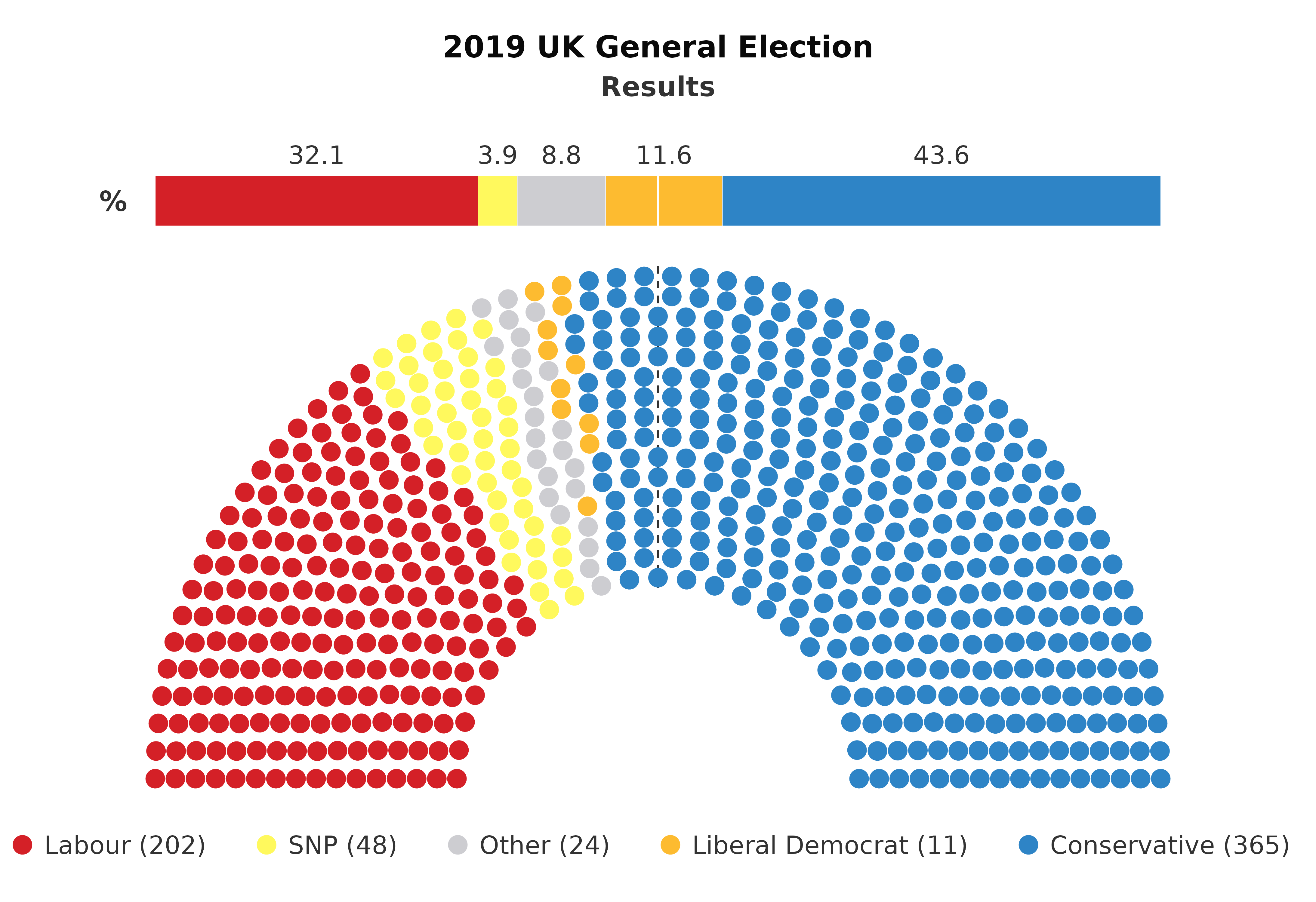
This plot offers an intuitive way to analyse election results,
party strengths, and their representation in the parliament. The
inclusion of a majority line further enhances the plot by delineating
the threshold needed for a majority.
Population
Understanding demographic distribution is vital in survey analysis.
plot_popn() creates visual representations of population
profiles.
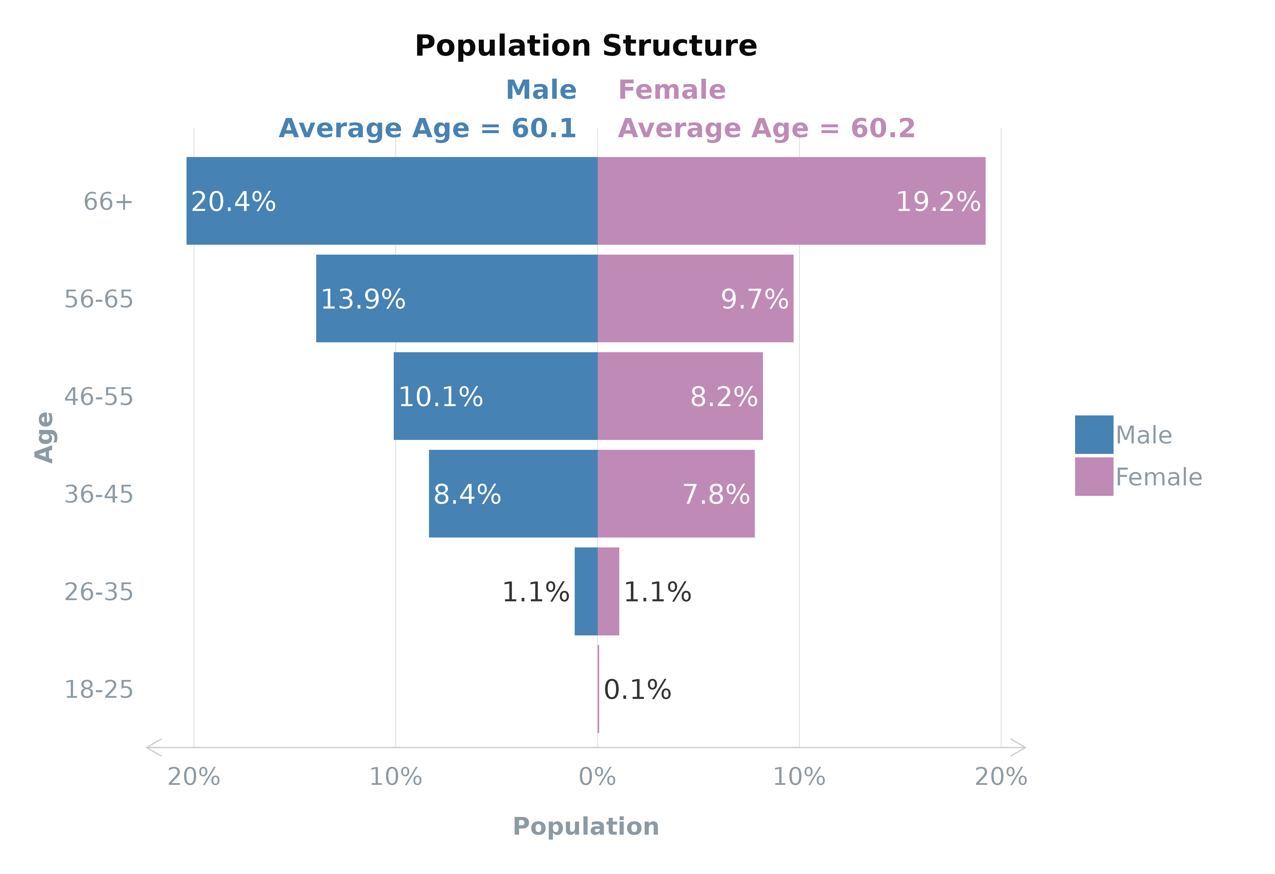
Using plot_popn
The plot_popn() function is designed to visualise the
population structure of your survey respondents. It creates a population
pyramid showing distributions across gender and age groups. If a
variable like average age (meanVar) is specified, the plot
can also display this information, adding another layer of insight into
the demographic composition.
plot_popn(data = survey_df,
          xVar = "gender",
          yVar = "ageGroup",
          weight = "wt", # optional
          meanVar = "age", # optional (must be numeric)
          addLabels = TRUE # to add % labels
)
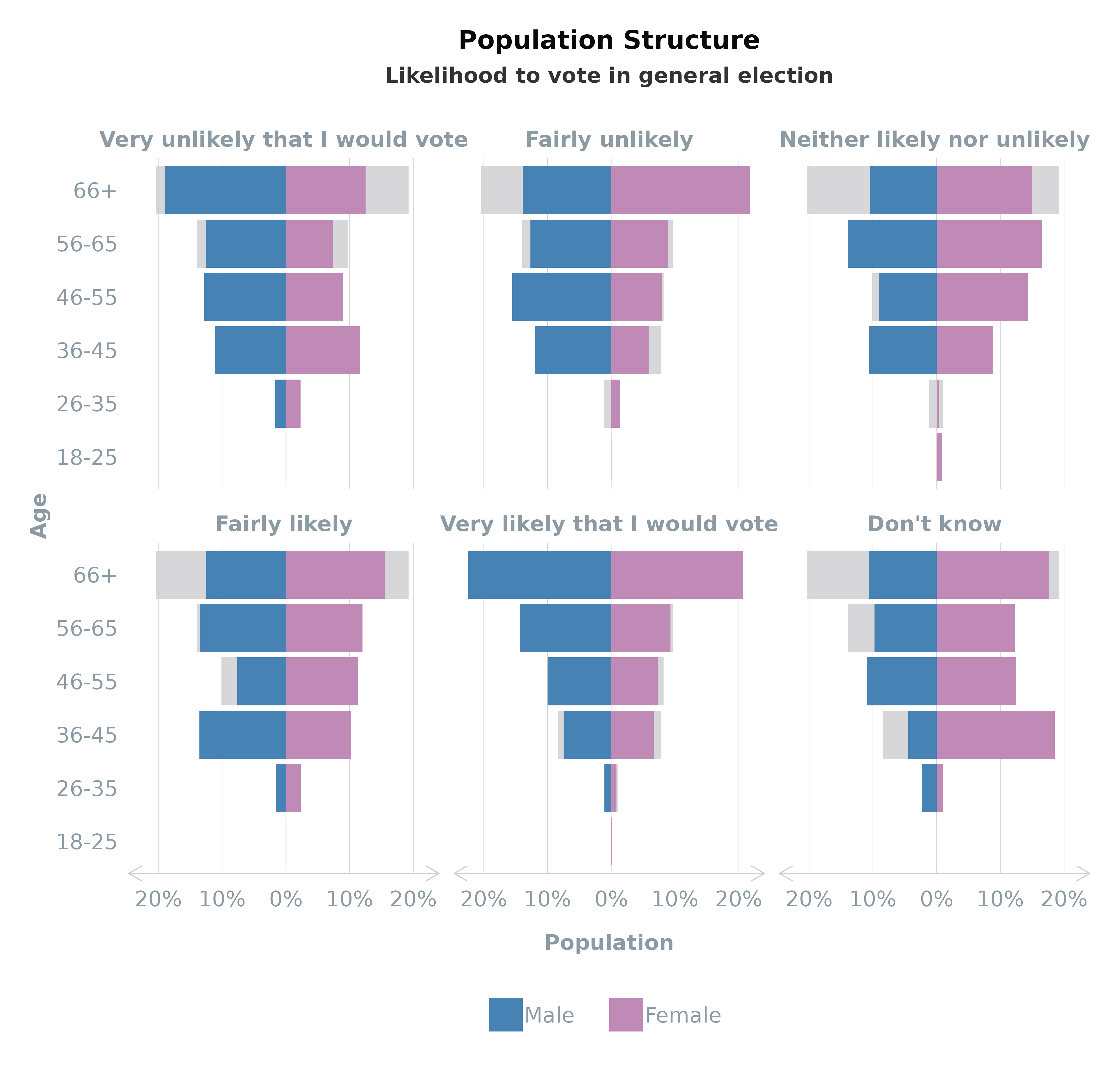
Faceting by Group
Enhance your population pyramid by faceting the
plot_popn plot by a specific group, such as voter turnout.
This feature overlays the selected group’s data onto the total
population structure, providing a comparative view that highlights
differences or similarities within subgroups.
plot_popn(data = survey_df,
          xVar = "gender",
          yVar = "ageGroup",
          group = "turnoutUKGeneral",
          weight = "wt", # optional
)
Personality
The plot_bigfive() function returns a ggplot2
chart to help visualise the personality profile of the survey data. This
radar chart is primarily to visualise the Big Five personality traits
(neuroticism, extroversion, openness, agreeableness, and
conscientiousness) but can be amended for other quantitative data types
with a scale between 0 and 100.
# Create single plot using unweighted data
plot_bigfive(bigfive_df,
             bigfive = c("Neuroticism", "Extroversion", "Openness", "Agreeableness", "Conscientiousness"))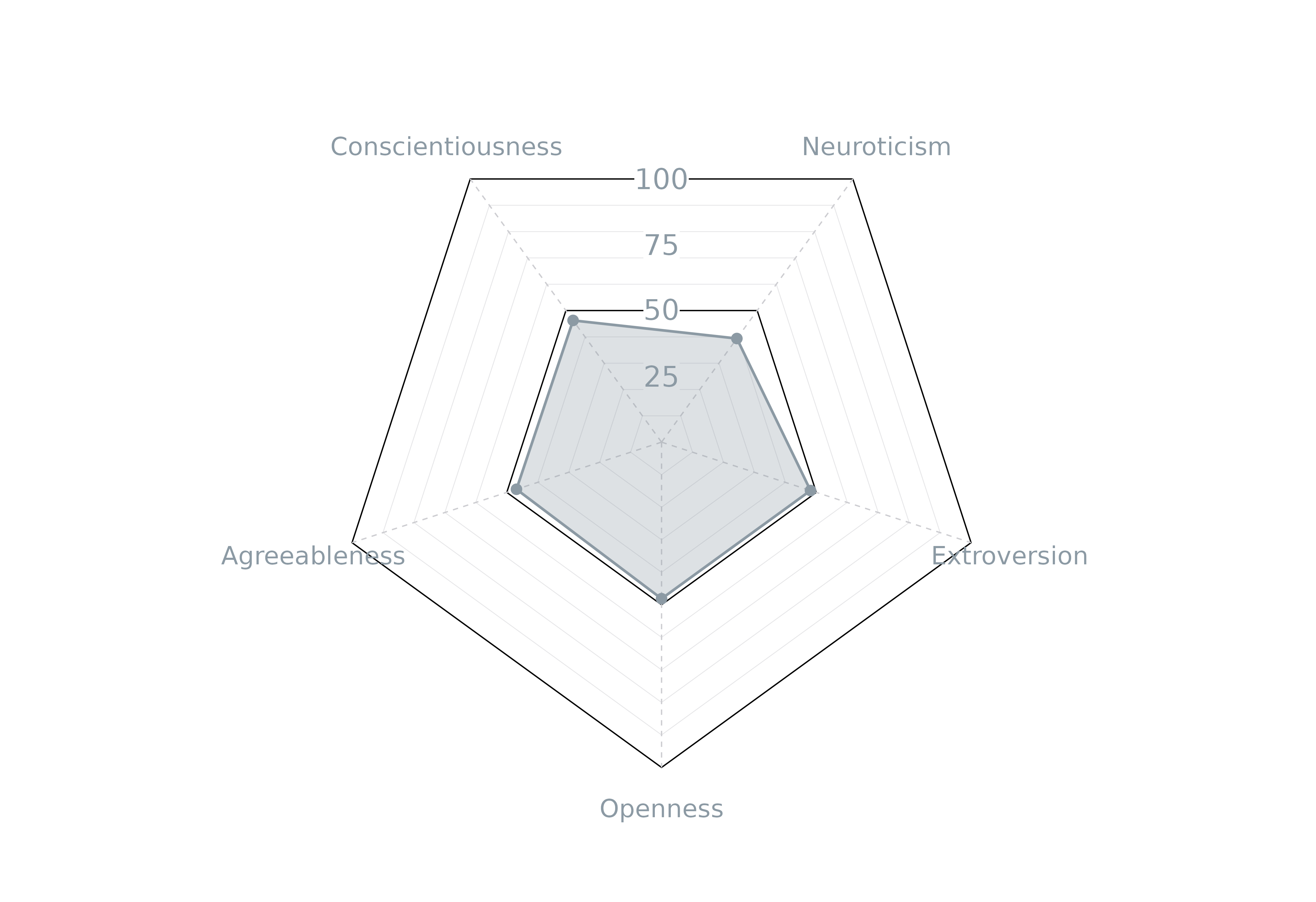
When a group is provided, the function returns faceted plots with the variables within the group plotted on top of the average. This provides an easy comparison between the variable and the rest of the cohort in the survey.
# Create faceted plot using age groups and weighted data
plot_bigfive(bigfive_df,
             bigfive = c("Neuroticism", "Extroversion", "Openness", "Agreeableness", "Conscientiousness"),
             group = "Gender",
             weight = "Weight")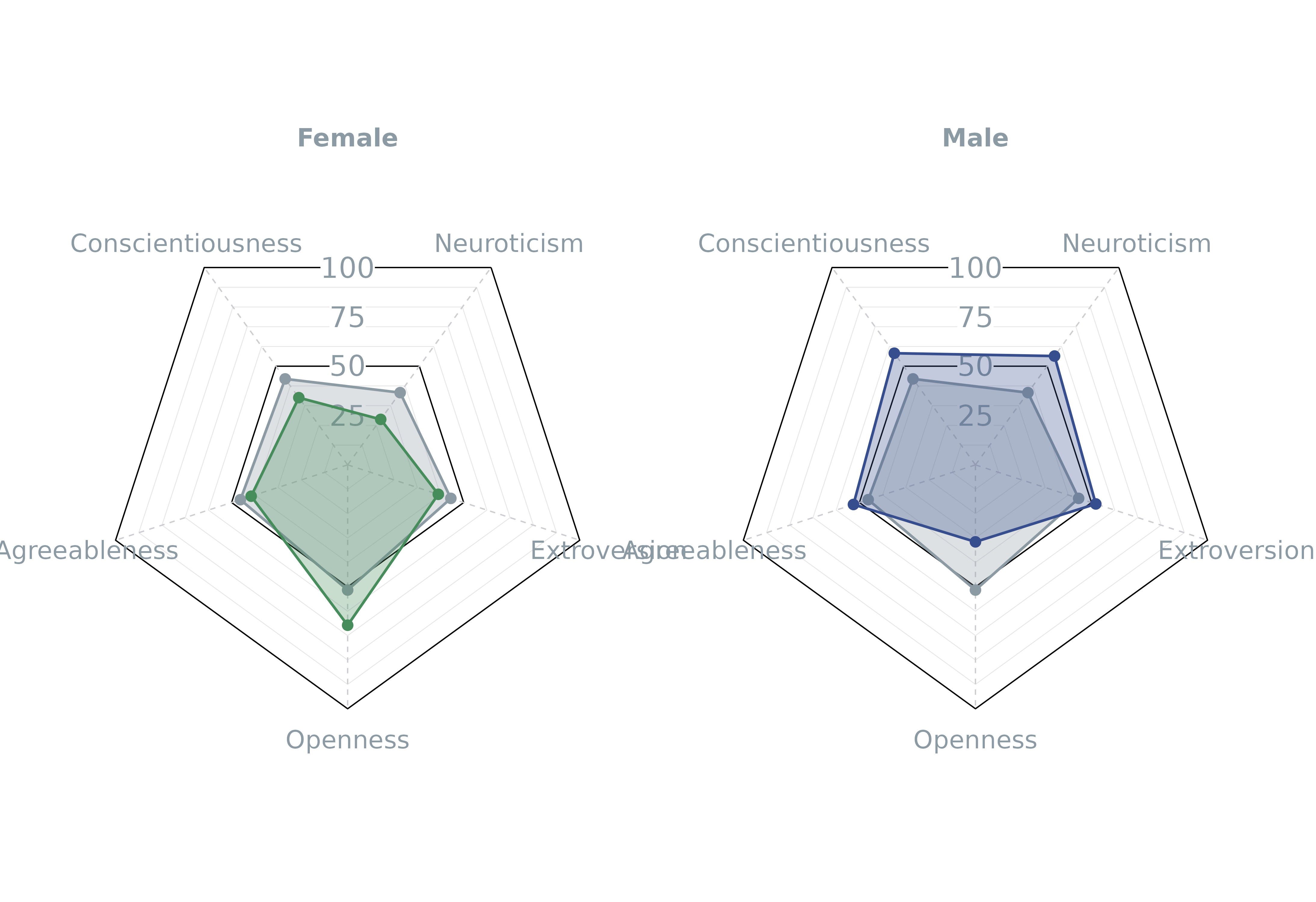
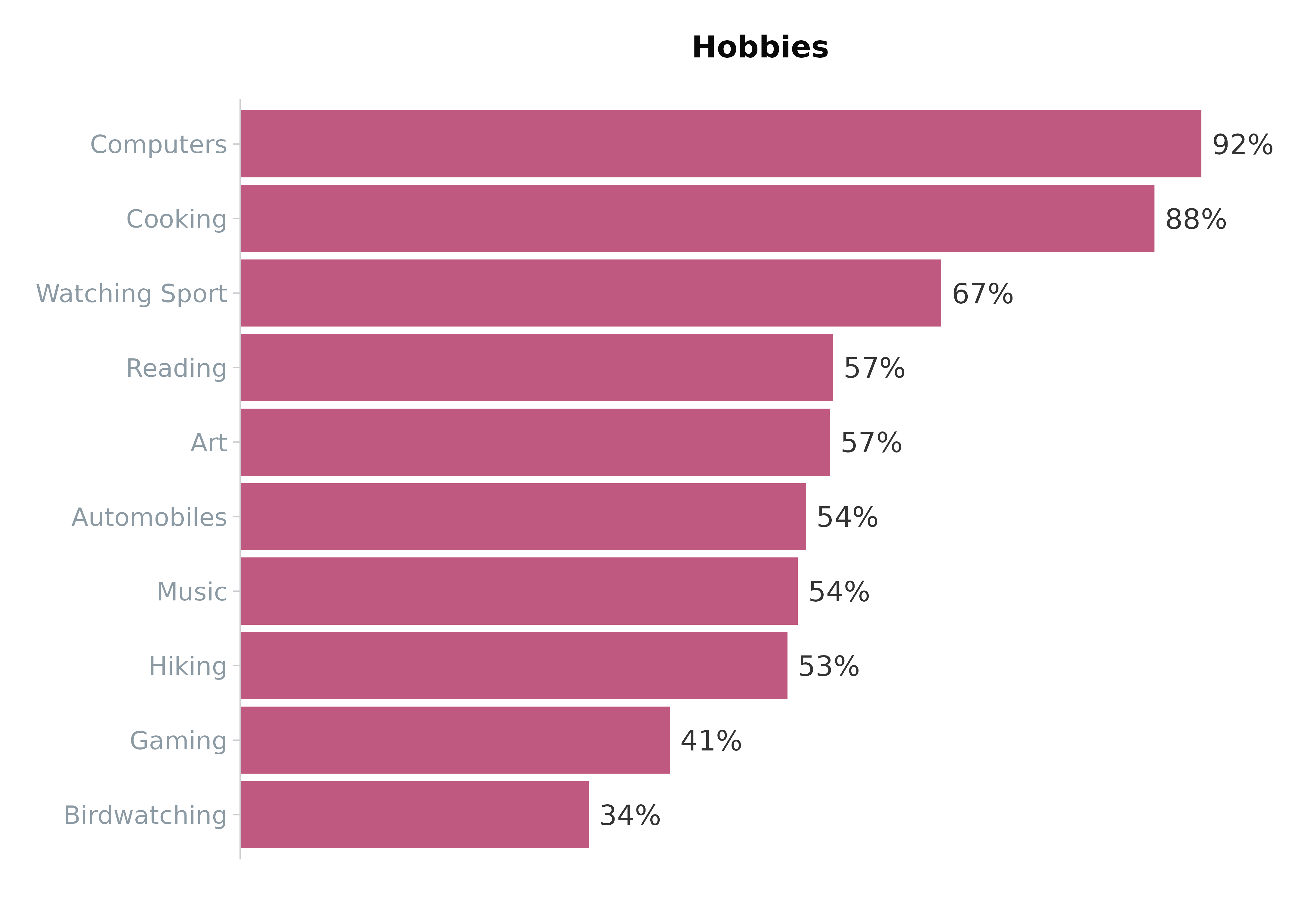
Binary
The plot_binary() function visualises binary survey
responses (e.g., “Yes” vs “No”). It is particularly effective for
comparative analysis. This function utilises the
grid_vars() function to help transform the data into the
correct format.
# Create list for dummy data
vars <- list(Q1a = "Art",
             Q1b = "Automobiles",
             Q1c = "Birdwatching",
             Q1d = "Music",
             Q1e = "Reading",
             Q1f = "Cooking",
             Q1g = "Hiking",
             Q1h = "Watching Sport",
             Q1i = "Computers",
             Q1j = "Gaming"
)
# Create plot of total dataset using unweighted data
plot_binary(binary_df,
            vars = vars,
            value = "Yes",
            title = "Hobbies", # option
            totalColour = "maroon" # optional (default = grey)
)
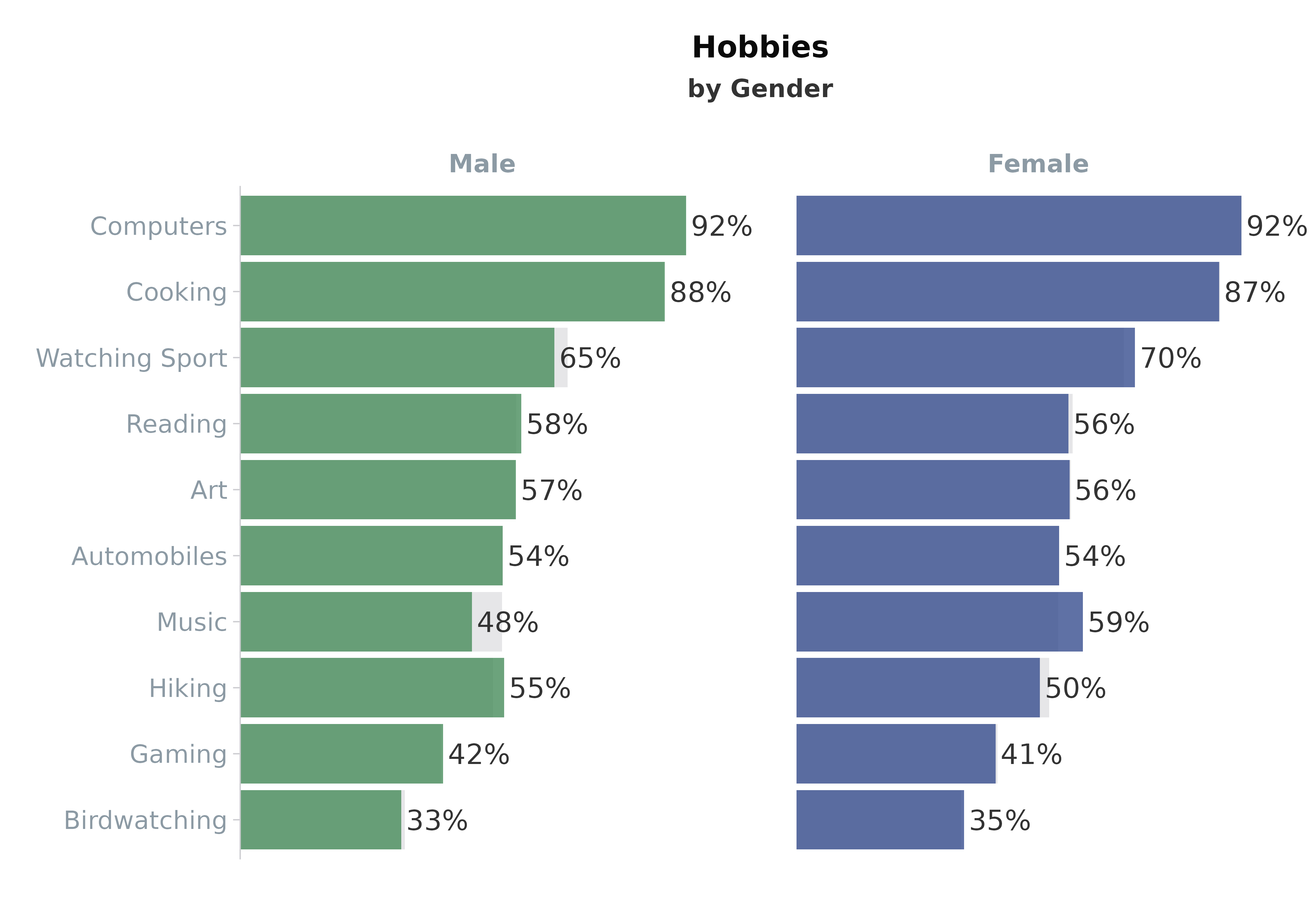
When a group is provided, the function return faceted plots with the variables within the group plotted against the total. This provides an easy comparison between the variable and the rest of the cohort in the survey.
# Create faceted plot using Gender and weighted data
plot_binary(binary_df,
            vars = vars,
            value = "Yes",
            group = "Gender", # optional
            weight = "Weight", # optional
            title = "Hobbies",
            subtitle = "by Gender"
)
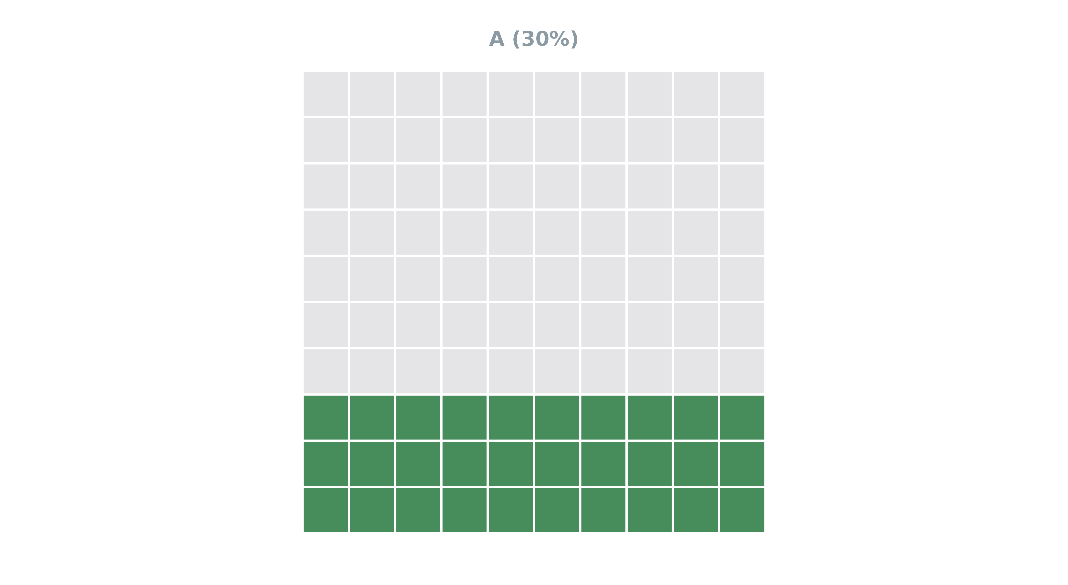
Waffle
Waffle plots provide a unique and compelling way to visualise
categorical data, making them ideal for representing proportions or
percentages in datasets, including survey responses. The
plot_waffle() function in the scgUtils package
offers a straightforward method to create these plots.
Basic Usage
The basic use of plot_waffle() involves creating a plot
that represents the distribution of different categories. This method is
especially effective for visually demonstrating the relative sizes of
groups within a population.
# Prepare Data
waffle_df <- data.frame(
  Category = c("A", "B", "C"),
  Count = c(30, 40, 30)
)

# Plot
plot_waffle(waffle_df,
            group = "Category",
            values = "Count",
            isolateVar = "A" # show a single plot only
)
Using plot_waffle() with Survey Data
plot_waffle() is particularly adept at handling survey
data, supporting both weighted and unweighted analysis. The function can
automatically extract and display relevant labels from survey questions,
enhancing the plot’s interpretability.
# Waffle plot with unweighted survey data
plot_waffle(survey_df %>% filter(p_socgrade != "Unknown"), # removing unknowns
            group = "p_socgrade",
            title = "p_socgrade"
)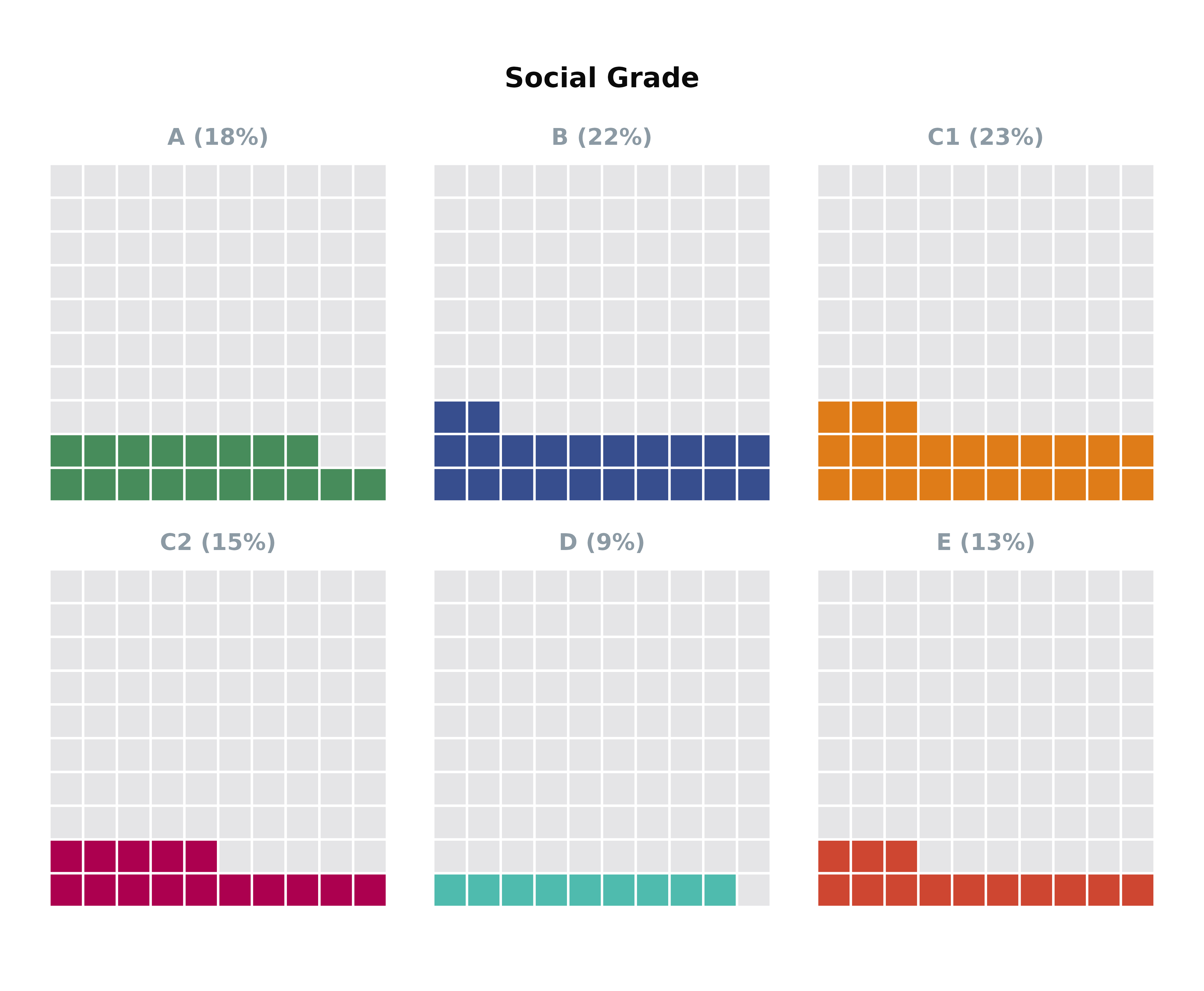
For a more refined visual presentation,
plot_waffle() allows customisation of colours and plot
order. This flexibility is invaluable for aligning the visual aesthetic
with specific data narratives or brand guidelines.
Likert Scales
Likert scales are a staple in survey research, providing detailed
insights into respondents’ attitudes and opinions. The
plot_likert() function within the scgUtils
package offers versatile visualisation options to effectively
communicate the nuances of Likert scale data. This function includes
three distinct visualisation styles:
- 100% Stacked Bars
- Diverging Bars
- Faceted Bars
Visualising Likert scale responses with a 100% stacked bar chart
allows for an intuitive comparison of agreement levels across different
questions or groups.
Stacked Bar Chart with One Question and One
Group
To enhance clarity and interpretability, the
plot_likert() function supports the optional
varLevels argument to dictate the order of response
variables. Colour customisation is achievable through the
colour_pal() function, aiding in distinguishing between
different levels of agreement or sentiment. Additionally, text colour is
set based on an internal contrast test to ensure readability of
labels.
# Prepare palette with 5 colours from the divergent colour scale Blue to Green
colours <- colour_pal(pal_name = "divBlueGreen",
                      n = 5, # number of colours required
                      assign = c("Strongly disagree", "Disagree",
                                 "Don't know",
                                 "Agree", "Strongly agree")
)

# Prepare varLevels as named list with 'left', 'neutral', and 'right' elements.
# (NB these must match all columns contained within vars
varLevels <- list(left = c("Strongly disagree", "Disagree"),
                  neutral = c("Don't know"),
                  right = c("Agree", "Strongly agree"))

# Likert plot with custom settings (weighted data and group on the y-axis)
plot_likert(survey_df,
            vars = "pidWeThey",
            group = "partyId",
            weight = "wt",
            varLevels = varLevels,
            total = TRUE, # set TRUE to add comparison against total population (available when group is present)
            NET = TRUE, # set TRUE to add NET score
            addLabels = TRUE, # Add % labels
            threshold = 5, # Set threshold for % that labels will be shown on plot
            order_by = "NET", # order bars by NET score
            title = get_question(survey_df, "pidWeThey"), # Add title
            subtitle = "by Party Identification", # Add subtitle
            colours = colours, # Add colours
            legend = "bottom" # Move legend to bottom

)
#> Warning in geom_text(aes(x = upperLim + 5, y = net_label_y_pos, label = heading), : All aesthetics have length 1, but the data has 46 rows.
#> ℹ Please consider using `annotate()` or provide this layer with data
#>   containing a single row.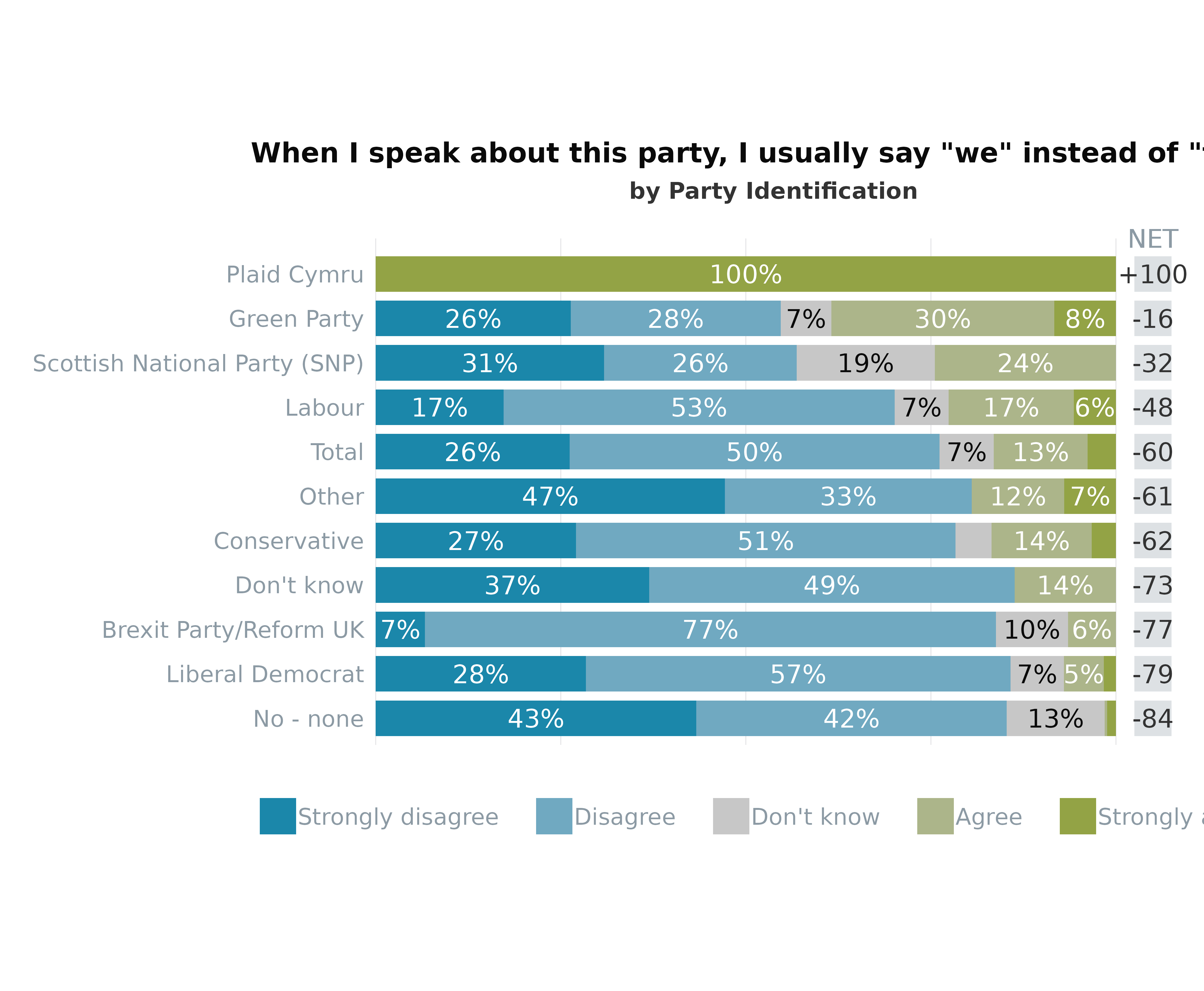
Basic Chart with Multiple Questions
This approach allows for a comprehensive overview of several questions
simultaneously, with the varLevels list controlling the
response variable ordering and the inclusion of a Net Promoter
Score-like metric for additional insight.
# Prepare vars argument as list. The strings will be plotted on the y axis.
vars <- list(likeSunak = "Sunak",
             likeStarmer = "Starmer",
             likeCon = "Conservative",
             likeLab = "Labour",
             likeLD = "Lib Dems",
             likeSNP = "SNP",
             likePC = "Plaid",
             likeBrexitParty = "Reform",
             likeGrn = "Greens"
)

# Response level settings
varLevels <- list(left = c("Strongly dislike", "1", "2", "3", "4"),
                  neutral = c("5", "Don't know"),
                  right = c("6", "7", "8", "9", "Strongly like"))

# Custom colours
colours <- colour_pal("divRedBlue", 11, c("Strongly dislike", "1", "2", "3", "4", "5", "6", "7", "8", "9", "Strongly like"))
colours$`Don't know` <- "grey90" # Make "Don't know" grey

# Plotting multiple questions (vars are along the y-axis)
plot_likert(survey_df,
            vars = vars,
            varLevels = varLevels,
            weight = "wt",
            colours = colours,
            NET = TRUE,
            order_by = "left", # ordering by the mean of Strongly dislike etc (left side)
            title = "Un*favourability of Political Parties and Leaders",
            legend = "bottom",
            nrow = 2, # put the legend on two rows
) +
  ggplot2::geom_vline(xintercept = 50, colour = "white") # add white intercept line at the 50% point
#> Warning in geom_text(aes(x = upperLim + 5, y = net_label_y_pos, label = heading), : All aesthetics have length 1, but the data has 108 rows.
#> ℹ Please consider using `annotate()` or provide this layer with data
#>   containing a single row.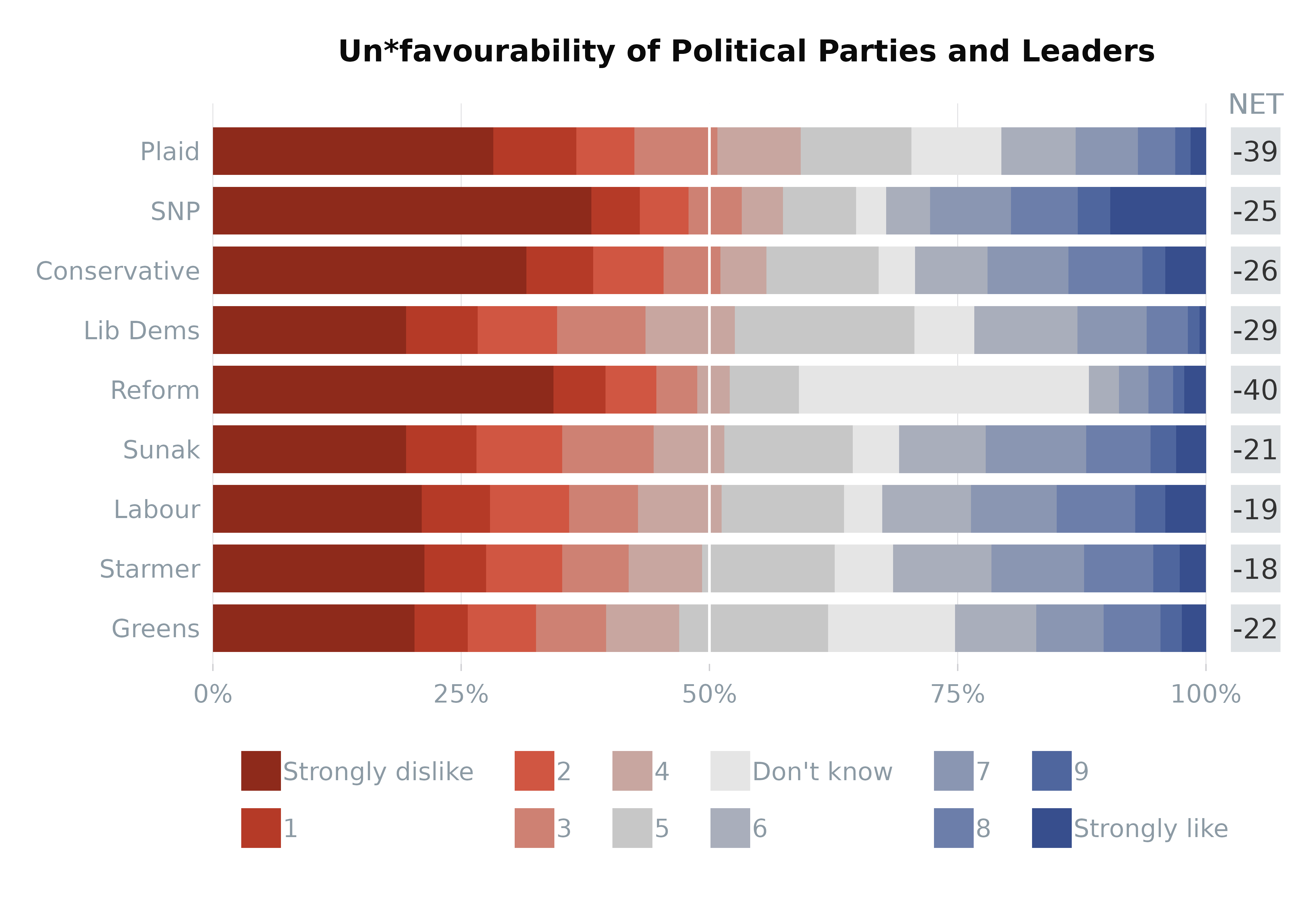
Grouped Likert Chart
Adding a grouping
variable allows for the nuanced comparison of Likert scale responses
across different segments of the survey population, further enriching
the data’s interpretative value.
# Plot weighted data faceted by EU referendum vote
plot_likert(survey_df,
            vars = vars,
            group = "p_eurefvote",
            varLevels = varLevels,
            weight = "wt",
            colours = colours,
            order_by = "left", # ordering by the mean of Strongly dislike etc (left side)
            title = "Un*favourability of Political Parties and Leaders",
            legend = "bottom",
            ncol = 1, # change number of columns from 3 to one to stack plots
            nrow = 2, # put the legend on two rows
            ratio = 3, # reduce the fixed ratio of the coordinates from 6 to 3
            base_size = 9 # reduce the base font from 10 to 9
) +
  ggplot2::geom_vline(xintercept = 50, colour = "white")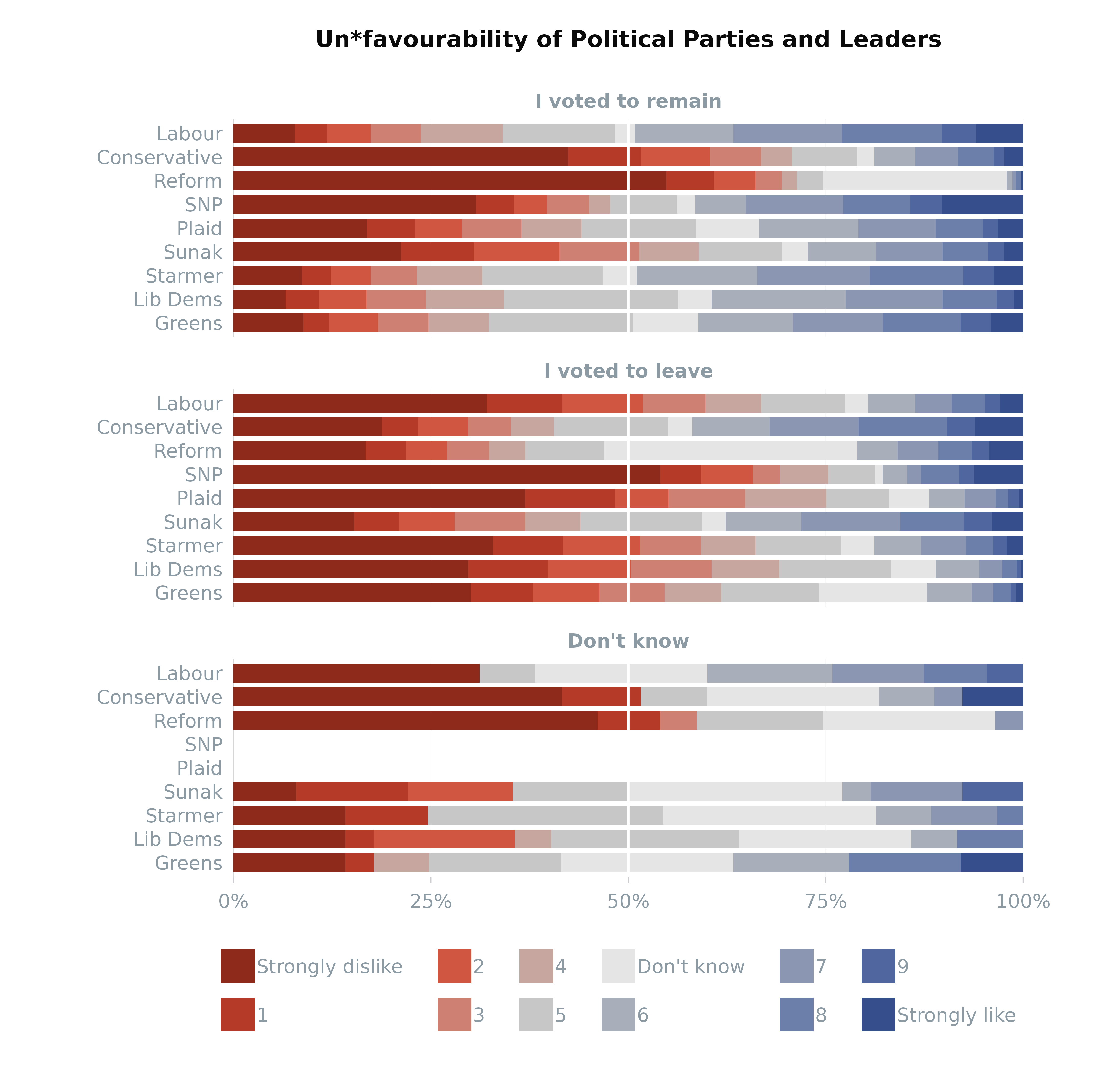
Divergent with NET and vars on
Y-Axis
varLevels <- list(left = c("Strongly dislike", "1", "2", "3", "4"),
                       neutral = c("5", "Don't know"),
                       right = c("6", "7", "8", "9", "Strongly like"))

plot_likert(survey_df,
            vars = vars,
            weight = "wt",
            type = "divergent",
            varLevels = varLevels,
            NET = TRUE, # add NET column
            colours = colours,
            order_by = "NET" # order by the NET values
)
#> Warning in geom_text(aes(x = upperLim + 5, y = net_label_y_pos, label = heading), : All aesthetics have length 1, but the data has 126 rows.
#> ℹ Please consider using `annotate()` or provide this layer with data
#>   containing a single row.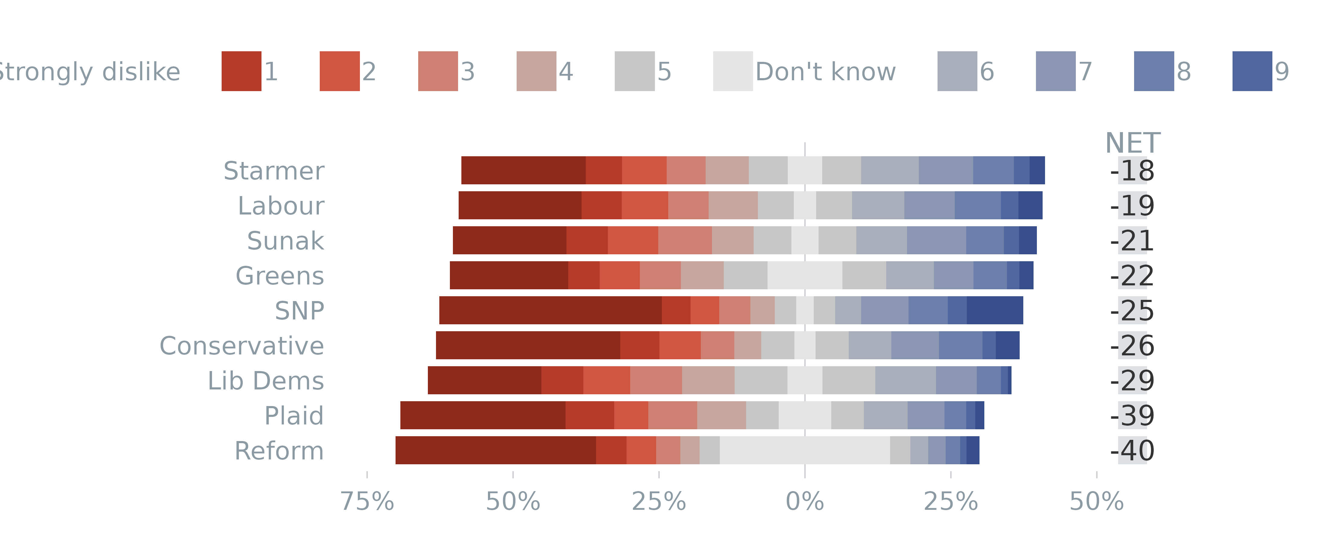
Divergent with neutrals on the right and
group on Y-Axis
varLevels <- list(left = c("Strongly disagree", "Disagree"),
                             neutral = "Don't know",
                             right = c("Agree", "Strongly agree"))

plot_likert(survey_df,
            vars = "pidWeThey",
            group = "gender",
            weight = "wt",
            type = "divergent",
            varLevels = varLevels,
            addLabels = TRUE, # turn labels on
            total = TRUE, # add totals
            neutrals = "right", # Place neutrals on right instead
            order_by = "left", # order by the negative/lhs values hand side
            legend = "bottom"
)
#> Warning in geom_text(aes(x = upperLim + 5, y = net_label_y_pos, label = heading), : All aesthetics have length 1, but the data has 12 rows.
#> ℹ Please consider using `annotate()` or provide this layer with data
#>   containing a single row.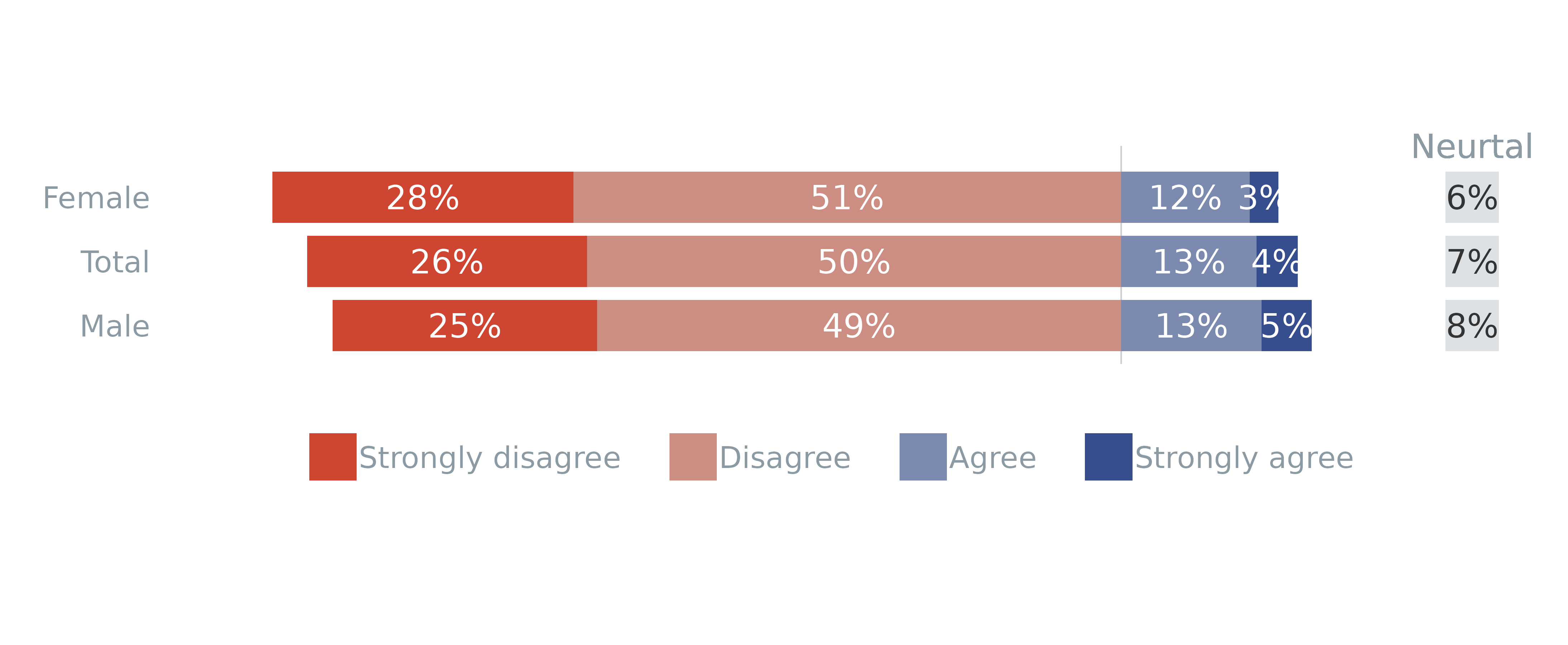
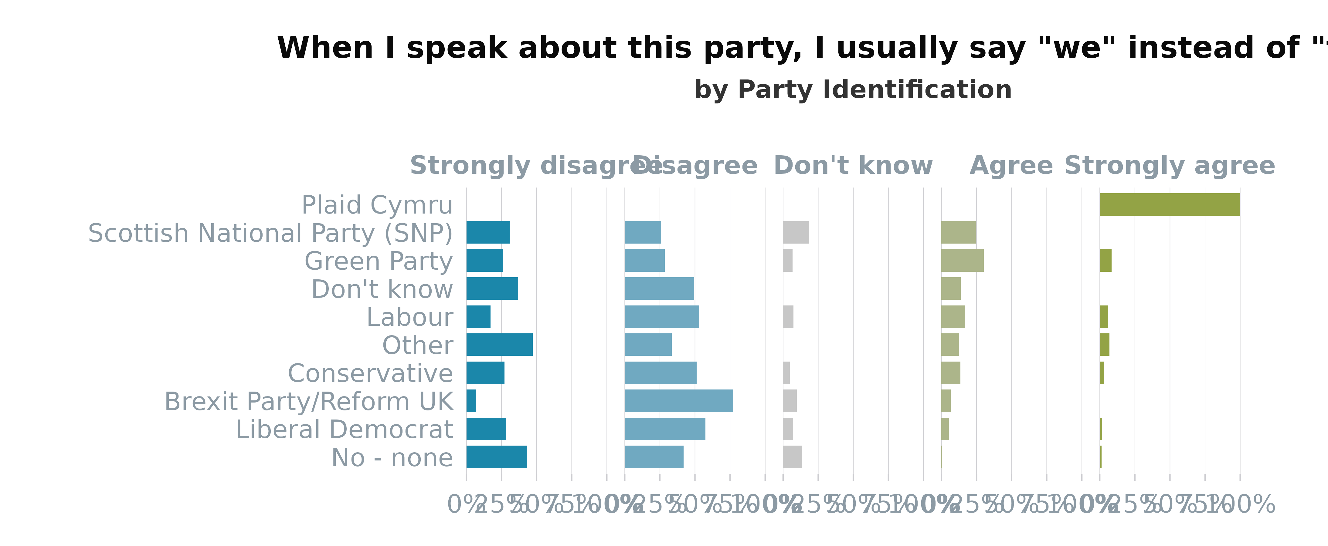
Facetted with group on
Y-Axis
# Prepare palette with 5 colours from the divergent colour scale Blue to Green
colours <- colour_pal(pal_name = "divBlueGreen",
                      n = 5, # number of colours required
                      assign = c("Strongly disagree", "Disagree",
                                 "Don't know",
                                 "Agree", "Strongly agree")
)

# Prepare varLevels as named list with 'left', 'neutral', and 'right' elements.
# (NB these must match all columns contained within vars
varLevels <- list(left = c("Strongly disagree", "Disagree"),
                  neutral = c("Don't know"),
                  right = c("Agree", "Strongly agree"))

# Likert plot with custom settings (weighted data and group on the y-axis)
plot_likert(survey_df,
            vars = "pidWeThey",
            group = "partyId",
            weight = "wt",
            varLevels = varLevels,
            type = "facetted", # Change type of plot
            order_by = "right", # order bars by left side
            title = get_question(survey_df, "pidWeThey"), # Add title
            subtitle = "by Party Identification", # Add subtitle
            colours = colours, # Add colours
            ratio = 10,
            legend = "none" # Turn off legend
)
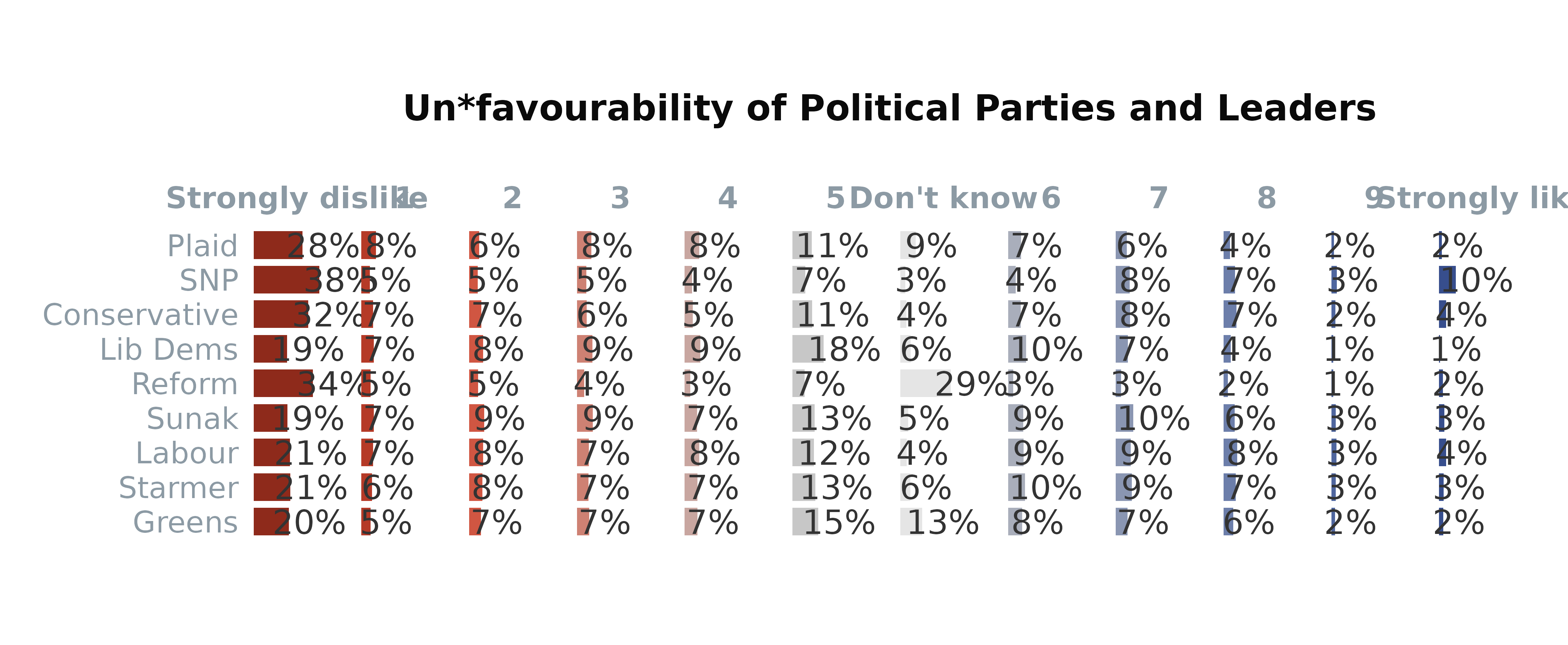
Facetted with vars on
Y-Axis
# Prepare vars argument as list. The strings will be plotted on the y axis.
vars <- list(likeSunak = "Sunak",
             likeStarmer = "Starmer",
             likeCon = "Conservative",
             likeLab = "Labour",
             likeLD = "Lib Dems",
             likeSNP = "SNP",
             likePC = "Plaid",
             likeBrexitParty = "Reform",
             likeGrn = "Greens"
)

# Response level settings
varLevels <- list(left = c("Strongly dislike", "1", "2", "3", "4"),
                  neutral = c("5", "Don't know"),
                  right = c("6", "7", "8", "9", "Strongly like"))

# Custom colours
colours <- colour_pal("divRedBlue", 11, c("Strongly dislike", "1", "2", "3", "4", "5", "6", "7", "8", "9", "Strongly like"))
colours$`Don't know` <- "grey90" # Make "Don't know" grey

# Plotting multiple questions (vars are along the y-axis)
plot_likert(survey_df,
            vars = vars,
            varLevels = varLevels,
            weight = "wt",
            type = "facetted",
            colours = colours,
            addLabels = TRUE,
            ratio = 10,
            order_by = "left", # ordering by the mean of Strongly dislike etc (left side)
            title = "Un*favourability of Political Parties and Leaders",
            legend = "none"
)
Other Plots
Future updates to scgUtils will introduce other plots
such as:
-
plot_dumbbell()which can be used to compare two categories and view the differences between numeric data. -
plot_wordcloud()to highlight keywords from either qualitative or quantitative results. -
plot_donut()to illustrate numerical proportions. -
plot_radar()which will expand the capabilities ofplot_bigfive()in order to allow the comparison of any numeric multivariate data. -
plot_mekko()to represent categorical data with multiple subcategories.